home
about
works
playground
APEX Cricket Website
Overview
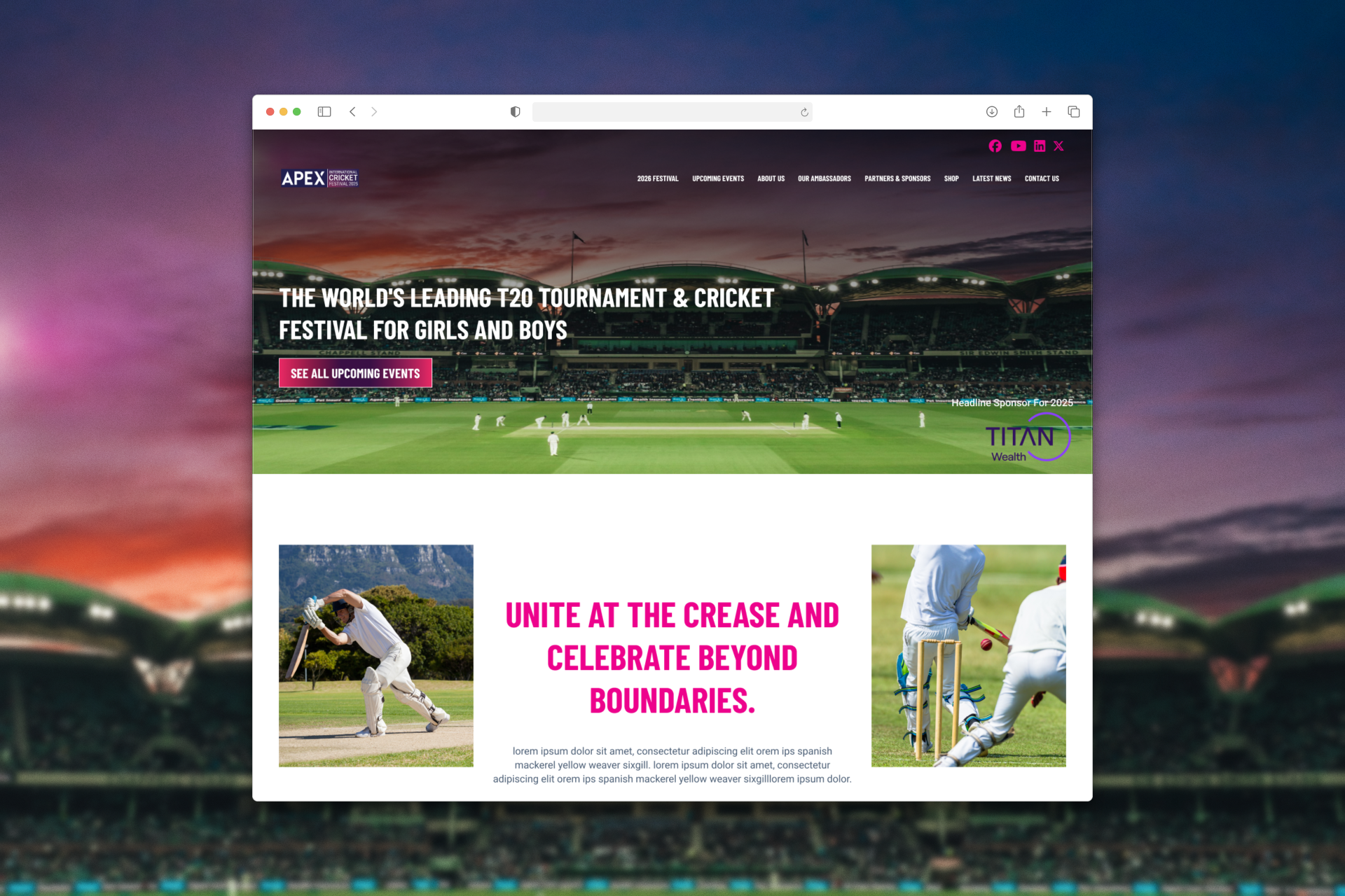
Apex Cricket is a cricket festival that needed its digital presence to match the ambition of the game it represents. The project was a full website redesign, taking an outdated, structurally inconsistent site and rebuilding it into something fans and players would actually want to use. The work spanned visual identity, information architecture, and layout design, all aimed at giving the festival a credible, engaging home on the web.
about the project.
The Problem
Apex Cricket's existing website had fallen behind the standard its audience expected. The visual design felt dated and disconnected from the energy of the sport, failing to reflect the credibility of the club. Beyond aesthetics, the site lacked a consistent structural logic, sections had no clear hierarchy, page layouts varied unpredictably, and both fans and players found themselves lost navigating what should have been simple information. The site was creating friction where it should have been building community.
Objectives
- Rebuild the visual identity to give Apex Cricket a professional, editorial presence that matches the stature of the sport
- Establish a consistent information hierarchy across all pages so fans and players can find what they need without effort
- Increase fan engagement by creating a site experience that feels alive, relevant, and worth returning to
- Design a cohesive layout system that scales across all content types, schedules, etc
outcome.
Design
I started by exploring different visual directions that could elevate the brand without losing clarity. Before committing to one idea, I created three high-fidelity homepage concepts, each exploring a slightly different tone and layout approach.
All of them focused on structure, spacing, and calm visual hierarchy, nothing loud, nothing unnecessary. After presenting the options, I worked closely with the client to refine and choose the direction that felt most aligned with their vision. Once the direction was locked, I continued designing the rest of the pages, making sure everything felt consistent, intentional, and easy to navigate.
The final result is a website that feels more confident, more structured, and more aligned with what UK Life stands for, simple, reassuring, and trustworthy.
home
about
works
playground
lets collaborate
APEX Cricket Website
Overview
Apex Cricket is a cricket festival that needed its digital presence to match the ambition of the game it represents. The project was a full website redesign, taking an outdated, structurally inconsistent site and rebuilding it into something fans and players would actually want to use. The work spanned visual identity, information architecture, and layout design, all aimed at giving the festival a credible, engaging home on the web.
about the project.
The Problem
Apex Cricket's existing website had fallen behind the standard its audience expected. The visual design felt dated and disconnected from the energy of the sport, failing to reflect the credibility of the club. Beyond aesthetics, the site lacked a consistent structural logic, sections had no clear hierarchy, page layouts varied unpredictably, and both fans and players found themselves lost navigating what should have been simple information. The site was creating friction where it should have been building community.
Objective
- Rebuild the visual identity to give Apex Cricket a professional, editorial presence that matches the stature of the sport
- Establish a consistent information hierarchy across all pages so fans and players can find what they need without effort
- Increase fan engagement by creating a site experience that feels alive, relevant, and worth returning to
- Design a cohesive layout system that scales across all content types, schedules, etc
outcome.
Design
I started by exploring different visual directions that could elevate the brand without losing clarity. Before committing to one idea, I created three high-fidelity homepage concepts, each exploring a slightly different tone and layout approach.
All of them focused on structure, spacing, and calm visual hierarchy, nothing loud, nothing unnecessary. After presenting the options, I worked closely with the client to refine and choose the direction that felt most aligned with their vision. Once the direction was locked, I continued designing the rest of the pages, making sure everything felt consistent, intentional, and easy to navigate.
The final result is a website that feels more confident, more structured, and more aligned with what UK Life stands for, simple, reassuring, and trustworthy.
home
about
works
playground
lets collaborate
APEX Cricket Website
Overview
Apex Cricket is a cricket festival that needed its digital presence to match the ambition of the game it represents. The project was a full website redesign, taking an outdated, structurally inconsistent site and rebuilding it into something fans and players would actually want to use. The work spanned visual identity, information architecture, and layout design, all aimed at giving the festival a credible, engaging home on the web.
about the project.
The Problem
Apex Cricket's existing website had fallen behind the standard its audience expected. The visual design felt dated and disconnected from the energy of the sport, failing to reflect the credibility of the club. Beyond aesthetics, the site lacked a consistent structural logic, sections had no clear hierarchy, page layouts varied unpredictably, and both fans and players found themselves lost navigating what should have been simple information. The site was creating friction where it should have been building community.
Objectives
- Rebuild the visual identity to give Apex Cricket a professional, editorial presence that matches the stature of the sport
- Establish a consistent information hierarchy across all pages so fans and players can find what they need without effort
- Increase fan engagement by creating a site experience that feels alive, relevant, and worth returning to
- Design a cohesive layout system that scales across all content types, schedules, etc
outcome.
Design
The redesign delivered a bold, sports-media inspired visual identity, confident typography, a structured editorial grid, and a consistent design language carried across every page. The new information architecture gave the site a clear backbone, making navigation intuitive for both casual fans and active players. The result is a digital presence that feels worthy of the club: credible, dynamic, and built for the community it serves.