home
about
works
playground
Big Fat Links
Overview
Big Fat Links is a service-focused website helping businesses grow through SEO, backlinks, and link-building strategies. The goal wasn’t to explain what they do,
but to make their expertise feel credible at first glance.
about the project.
The Problem
There were a few things that stood out early on:
- The visual direction didn’t match the brand’s personality.
- The layout didn’t guide attention clearly.
- And the overall experience didn’t feel as focused as the service itself.
On top of that, the timeline was tight, which meant every decision had to be deliberate.
but to make their expertise feel credible at first glance.
Objectives
Big Fat Links came to me because their website didn’t feel right anymore.
It worked, sure, but it didn’t feel like them.
They’re in the SEO and link-building space, but their site felt too generic.
Too safe. Too similar to everyone else doing the same thing. They wanted something that felt more premium. More confident. Less “we’re trying to sell you something.”
outcome.
Design
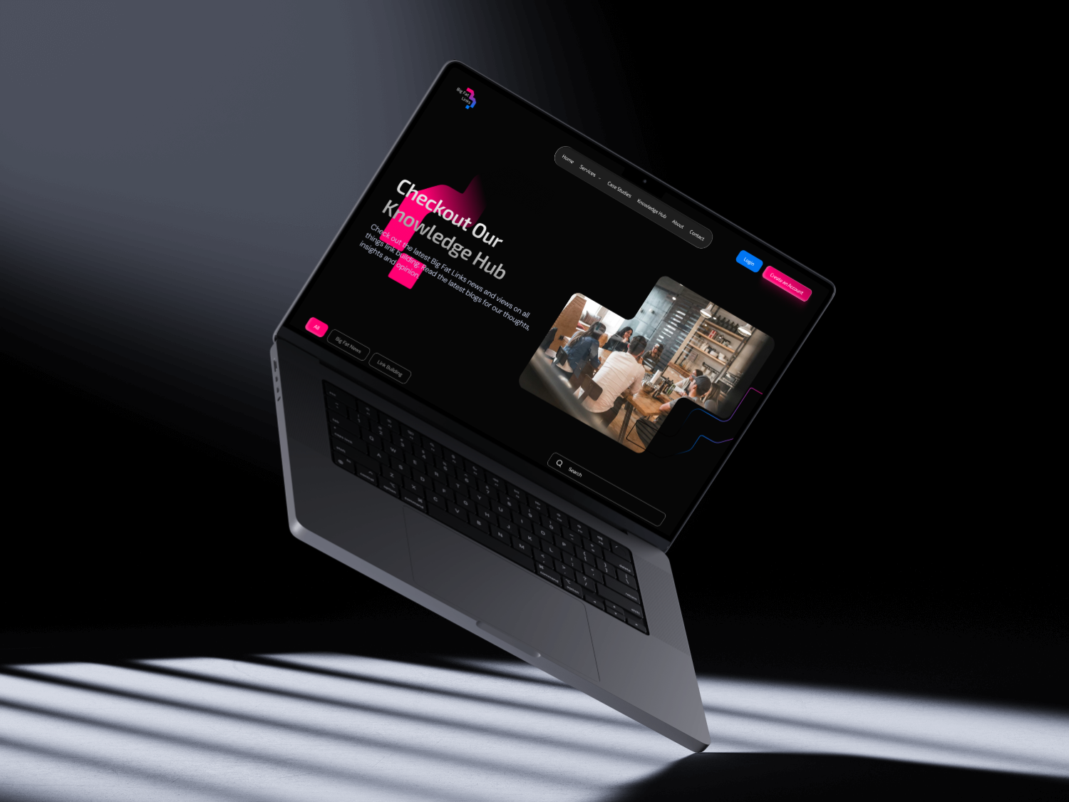
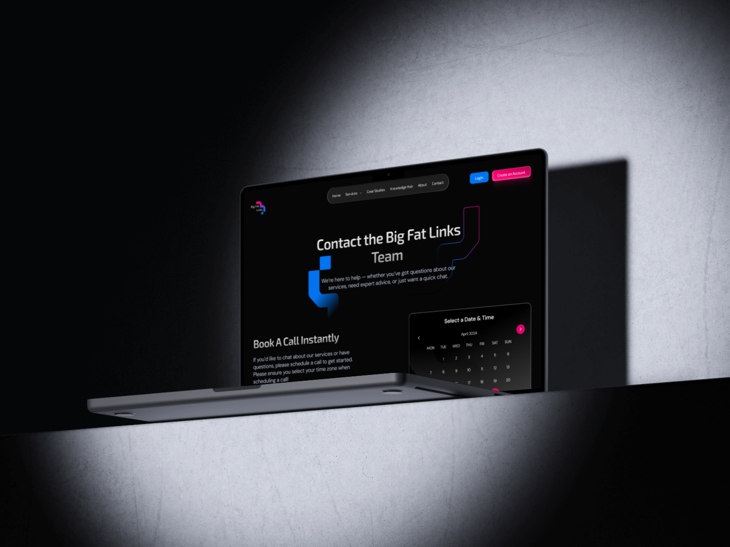
I approached this by simplifying first. Instead of adding more, I focused on removing noise. I wanted the interface to feel calm, confident, and intentional.
I used a darker visual foundation to give the site more weight,
and built a clearer hierarchy so users could understand the message without effort.
Every choices, spacing, typography, layout was meant to support one thing:
clarity.
home
about
works
playground
lets collaborate
Big Fat Links
Overview
Big Fat Links is a service-focused website helping businesses grow through SEO, backlinks, and link-building strategies. The goal wasn’t to explain what they do,
but to make their expertise feel credible at first glance.
about the project.
The Problem
There were a few things that stood out early on:
- The visual direction didn’t match the brand’s personality.
- The layout didn’t guide attention clearly.
- And the overall experience didn’t feel as focused as the service itself.
On top of that, the timeline was tight, which meant every decision had to be deliberate.
but to make their expertise feel credible at first glance.
Objectives
Big Fat Links came to me because their website didn’t feel right anymore.
It worked, sure, but it didn’t feel like them.
They’re in the SEO and link-building space, but their site felt too generic.
Too safe. Too similar to everyone else doing the same thing. They wanted something that felt more premium. More confident. Less “we’re trying to sell you something.”
outcome.
Design
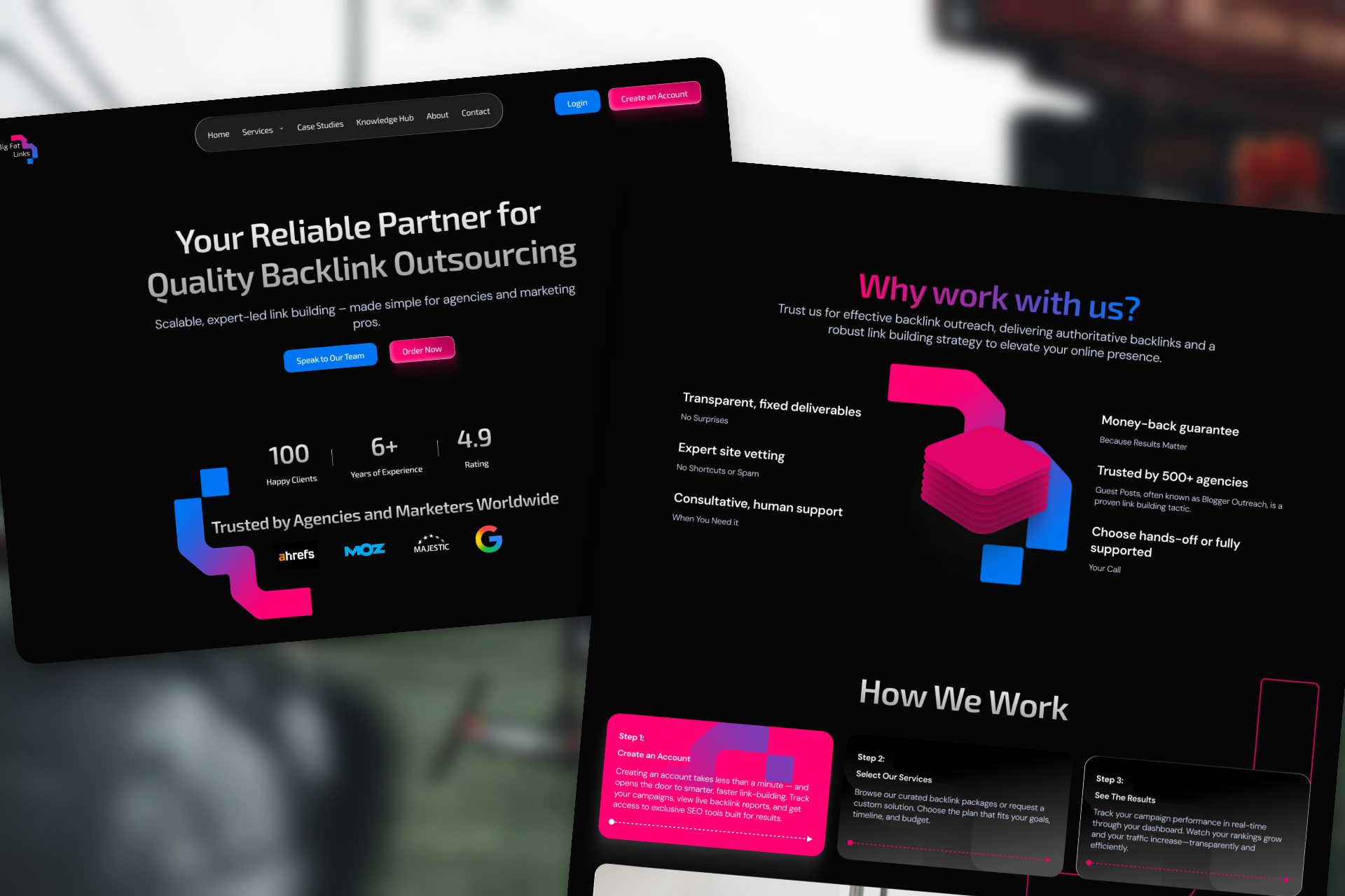
I approached this by simplifying first. Instead of adding more, I focused on removing noise. I wanted the interface to feel calm, confident, and intentional.
I used a darker visual foundation to give the site more weight,
and built a clearer hierarchy so users could understand the message without effort.
Every choices, spacing, typography, layout was meant to support one thing:
clarity.
home
about
works
playground
lets collaborate
Big Fat Links
Overview
Big Fat Links is a service-focused website helping businesses grow through SEO, backlinks, and link-building strategies. The goal wasn’t to explain what they do,
but to make their expertise feel credible at first glance.
about the project.
The Problem
There were a few things that stood out early on:
- The visual direction didn’t match the brand’s personality.
- The layout didn’t guide attention clearly.
- And the overall experience didn’t feel as focused as the service itself.
On top of that, the timeline was tight, which meant every decision had to be deliberate.
but to make their expertise feel credible at first glance.
Objectives
Big Fat Links came to me because their website didn’t feel right anymore.
It worked, sure, but it didn’t feel like them.
They’re in the SEO and link-building space, but their site felt too generic.
Too safe. Too similar to everyone else doing the same thing. They wanted something that felt more premium. More confident. Less “we’re trying to sell you something.”
outcome.
Design
I approached this by simplifying first. Instead of adding more, I focused on removing noise. I wanted the interface to feel calm, confident, and intentional.
I used a darker visual foundation to give the site more weight,
and built a clearer hierarchy so users could understand the message without effort.
Every choices, spacing, typography, layout was meant to support one thing:
clarity.