home
about
works
playground
UK Life Insurance
Overview
This was a redesign project for UK Life, a brand that operates in the insurance and financial space. The goal was pretty clear: refresh their website so it feels more aligned with their brand direction, while keeping things professional and trustworthy.
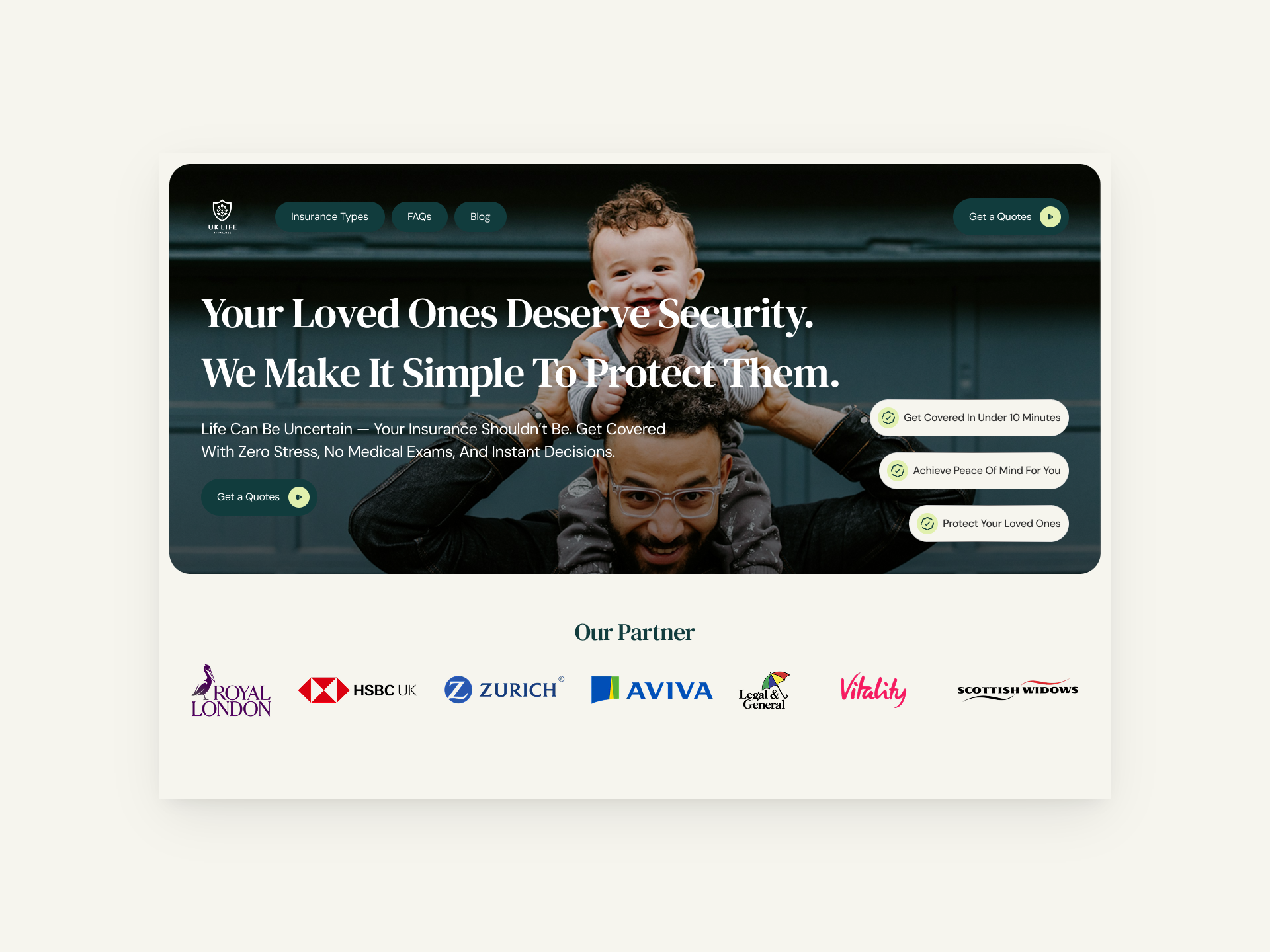
about the project.
Context
Before touching any design, I always like to understand what already exists. So I checked their current website first. And honestly, it felt outdated. The layout lacked structure, the hierarchy wasn’t clear, and visually it didn’t reflect the credibility you’d expect from an insurance brand. It worked, but it didn’t communicate.
At this stage, I wasn’t thinking about visuals yet. I was thinking about how someone would feel landing on the site for the first time, especially someone who’s about to make a serious financial decision.
The Problem
The main issue wasn’t that the website was broken. It was that it didn’t feel intentional.
Some things stood out:
The layout felt messy and inconsistent
There was no clear visual flow guiding users through the page
The overall impression didn’t match the brand’s credibility
In short, the website didn’t buit properly and didnt build enough trust for user, and for a life insurance product, that’s a big problem.
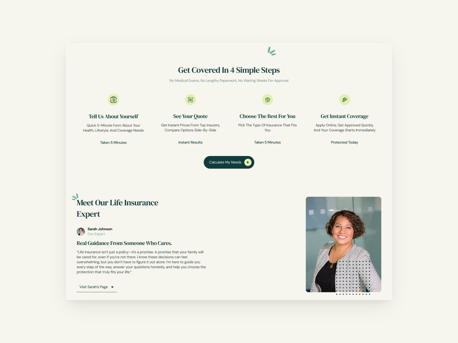
outcome.
Design
I started by exploring different visual directions that could elevate the brand without losing clarity. Before committing to one idea, I created three high-fidelity homepage concepts, each exploring a slightly different tone and layout approach.
All of them focused on structure, spacing, and calm visual hierarchy, nothing loud, nothing unnecessary. After presenting the options, I worked closely with the client to refine and choose the direction that felt most aligned with their vision. Once the direction was locked, I continued designing the rest of the pages, making sure everything felt consistent, intentional, and easy to navigate.
The final result is a website that feels more confident, more structured, and more aligned with what UK Life stands for, simple, reassuring, and trustworthy.
home
about
works
playground
lets collaborate
UK Life Insurance
Overview
This was a redesign project for UK Life, a brand that operates in the insurance and financial space. The goal was pretty clear: refresh their website so it feels more aligned with their brand direction, while keeping things professional and trustworthy.
about the project.
Context
Before touching any design, I always like to understand what already exists. So I checked their current website first. And honestly, it felt outdated. The layout lacked structure, the hierarchy wasn’t clear, and visually it didn’t reflect the credibility you’d expect from an insurance brand. It worked, but it didn’t communicate.
At this stage, I wasn’t thinking about visuals yet. I was thinking about how someone would feel landing on the site for the first time, especially someone who’s about to make a serious financial decision.
The Problem
The main issue wasn’t that the website was broken. It was that it didn’t feel intentional.
Some things stood out:
- The layout felt messy and inconsistent
- There was no clear visual flow guiding users through the page
- The overall impression didn’t match the brand’s credibility
In short, the website didn’t buit properly and didnt build enough trust for user, and for a life insurance product, that’s a big problem.
outcome.
Design
I started by exploring different visual directions that could elevate the brand without losing clarity. Before committing to one idea, I created three high-fidelity homepage concepts, each exploring a slightly different tone and layout approach.
All of them focused on structure, spacing, and calm visual hierarchy, nothing loud, nothing unnecessary. After presenting the options, I worked closely with the client to refine and choose the direction that felt most aligned with their vision. Once the direction was locked, I continued designing the rest of the pages, making sure everything felt consistent, intentional, and easy to navigate.
The final result is a website that feels more confident, more structured, and more aligned with what UK Life stands for, simple, reassuring, and trustworthy.
home
about
works
playground
lets collaborate
UK Life Insurance
Overview
This was a redesign project for UK Life, a brand that operates in the insurance and financial space. The goal was pretty clear: refresh their website so it feels more aligned with their brand direction, while keeping things professional and trustworthy.
about the project.
Context
Before touching any design, I always like to understand what already exists. So I checked their current website first. And honestly, it felt outdated. The layout lacked structure, the hierarchy wasn’t clear, and visually it didn’t reflect the credibility you’d expect from an insurance brand. It worked, but it didn’t communicate.
At this stage, I wasn’t thinking about visuals yet. I was thinking about how someone would feel landing on the site for the first time, especially someone who’s about to make a serious financial decision.
The Problem
The main issue wasn’t that the website was broken. It was that it didn’t feel intentional.
Some things stood out:
- The layout felt messy and inconsistent
- There was no clear visual flow guiding users through the page
- The overall impression didn’t match the brand’s credibility
In short, the website didn’t buit properly and didnt build enough trust for user, and for a life insurance product, that’s a big problem.
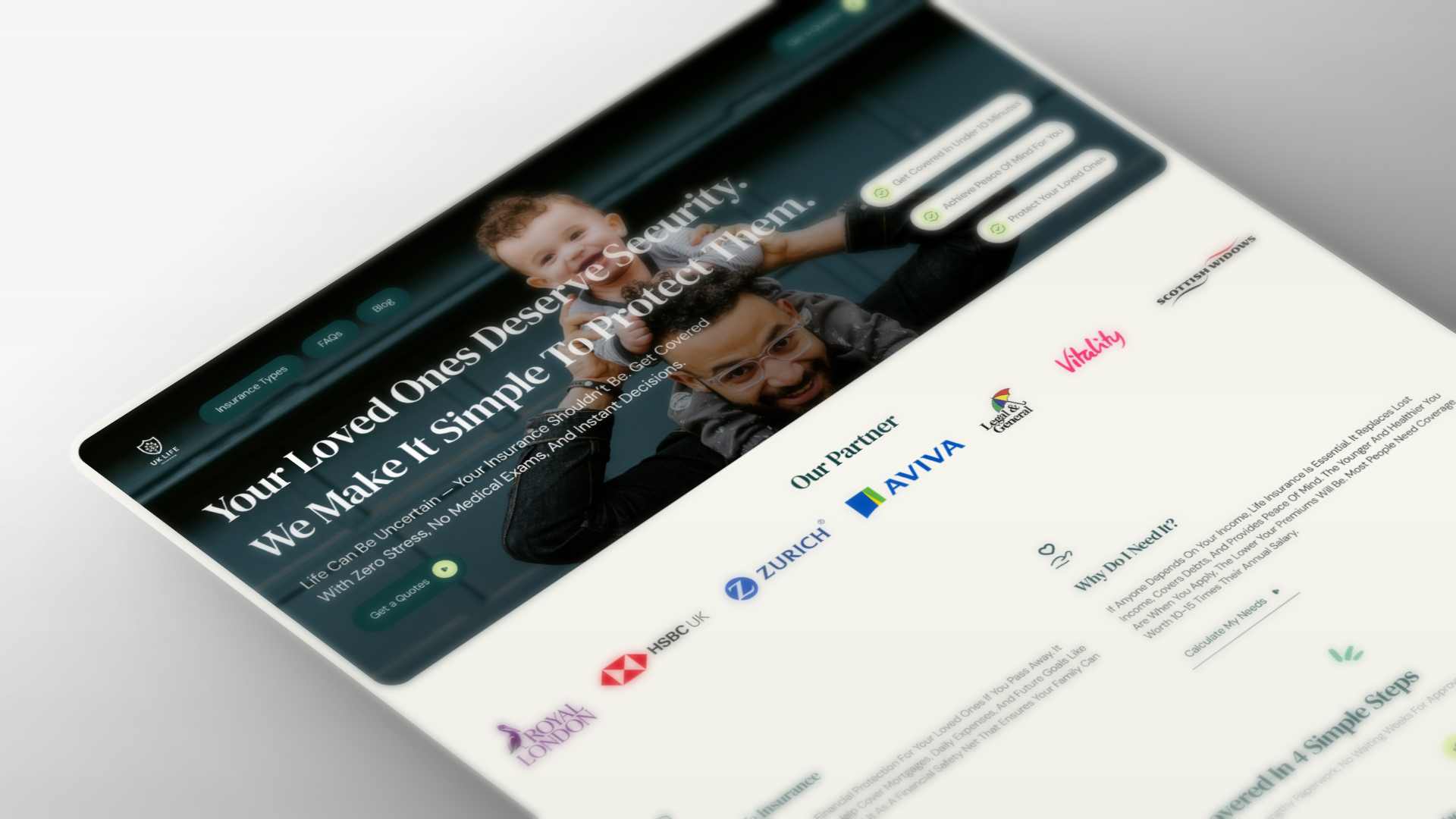
outcome.
Design
I started by exploring different visual directions that could elevate the brand without losing clarity. Before committing to one idea, I created three high-fidelity homepage concepts, each exploring a slightly different tone and layout approach.
All of them focused on structure, spacing, and calm visual hierarchy, nothing loud, nothing unnecessary. After presenting the options, I worked closely with the client to refine and choose the direction that felt most aligned with their vision. Once the direction was locked, I continued designing the rest of the pages, making sure everything felt consistent, intentional, and easy to navigate.
The final result is a website that feels more confident, more structured, and more aligned with what UK Life stands for, simple, reassuring, and trustworthy.